Behind the scenes
Designing Timelogger Plus for the iPhone Duo
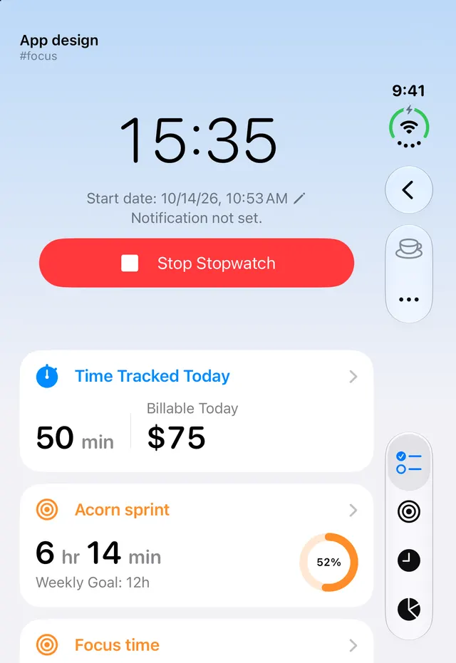
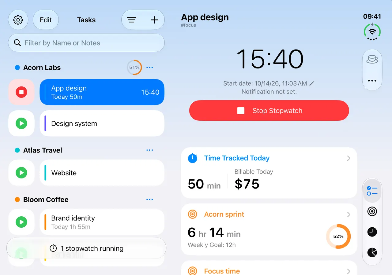
How Timelogger Plus uses both of iPhone Duo's displays: quick timers on the outer display, list and details side by side when it opens.
The iPhone Duo gives an app two very different screens. Closed, the outer display is tall and narrow, close to a regular iPhone. Open, the inner display is wider than it is tall, closer to a small iPad. Timelogger Plus has to feel right on both, and the move between them has to be smooth.
Size, not device
Timelogger Plus never asks “is this a Duo?”. It asks how much room it has. With a narrow width it shows one column; with a wide one, it shows the list and the details side by side. The same rule handles iPad Split View, Stage Manager windows on the Mac, and the Duo opening in your hands.
Closed: one task at a time
On the outer display you usually want one thing quickly: start a stopwatch, check today’s total, stop it. The task details show the running time, today’s tracked time and billable amount, and the goals that task counts towards. The tab bar runs down the side, where your thumb already is.
Open: the same task, with room around it
When you open the Duo, the task you were looking at stays in the same place, on the right half, while your task list appears on the left. That matches how the device behaves: whatever was on the outer display stays put, and the left half brings in what’s new. You don’t lose your place, and switching tasks takes one tap in the list.
The Dashboard across the fold
The Dashboard uses the whole inner display: the week’s figures in a grid of cards, and the chart of hours per day below them, all visible at once instead of one card after another.
What’s next
Duo owners use their devices in ways I haven’t seen yet. If you have one, I’d like to hear what works and what doesn’t. My email is at the bottom of every page.